Ever wonder what type of technology is used by a web-based project management application’s customers? What browsers do they prefer? What operating systems are favored? Where in the world they are coming from? We’ve got some of those numbers to share with you, based on our own online project management software Intervals. We’ve crunched Intervals’ numbers to give you an idea of what the typical technological profile of our customers — web design, web development, creative agencies and professional services small businesses — looks like. Keep in mind, these numbers represent a niche — creative, computer and professional services oriented companies using online time, task and project management software. These numbers do not apply to the world at large.
In this post…
Web Browsers
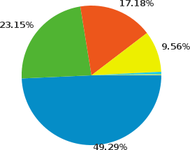
No surprise here. Firefox has been edging out Internet Explorer for the last year or two. What’s fascinating is seeing that Internet Explorer may soon drop to third place, usurped by the little V8 Javascript engine that could… Google Chrome. Safari is still hanging in there, but will have to stop trying to force its way into the iTunes install before small businesses start letting it anywhere near their Windows desktops.

| Browser | Percentage | |
|---|---|---|
| Firefox | 49.29% | |
| Internet Explorer | 23.15% | |
| Chrome | 17.18% | |
| Safari | 9.56% | |
| Opera | 0.51% | |
Operating Systems
Windows remains the number one operating system for our customers, with Macs making up the rest of the numbers. The Mac OS is very popular among web designers, developers and most creative agencies, however Windows is still favored by most small businesses, including IT companies and web developers. As for Linux, our numbers are probably higher than most web-based software due to our early commitment to supporting browsers on the Linux operating system and our continuing interest and enthusiasm for Ubuntu.

| Operating System | Percentage | |
|---|---|---|
| Windows | 70.50% | |
| Macintosh | 26.74% | |
| Linux | 2.44% | |
Screen Resolutions
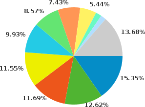
Web designers and developers can rejoice that the 1024×768 pixel screen resolution is almost extinct. In fact, it may just be the netbooks that are keeping this screen resolution alive. Larger and widescreen monitors have become the norm giving us more screen real estate and making us more productive. The wide variety of screen resolutions below reinforces our early commitment to making the Intervals layout liquid so that it will stretch and adapt to different screen widths.

| Screen Resolution | Percentage | |
|---|---|---|
| 1680×1050 | 15.35% | |
| 1440×900 | 12.62% | |
| 1280×1024 | 11.69% | |
| 1280×800 | 11.55% | |
| 1920×1200 | 9.93% | |
| 1024×768 | 8.57% | |
| 1920×1080 | 7.43% | |
| 1366×768 | 5.44% | |
Mobile Devices
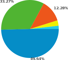
The iPhone has shown to be the most popular mobile device for browsing the web, which is one of the main reasons we built a mobile friendly version of Intervals. And the iPad has quickly caught on as a popular device for browsing the web while on the go, its larger screen resolution and Safari web browser making it ideal for using web-based applications. Android is quickly gobbling up Apple’s market share and it may not be long before we see it moving up a position or two.

| Mobile Device | Percentage | |
|---|---|---|
| iPhone | 49.64% | |
| iPad | 33.27% | |
| Android | 12.28% | |
| BlackBerry | 3.02% | |
Countries and Territories
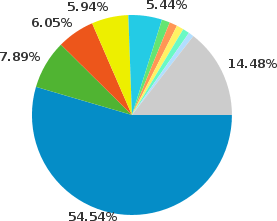
The United States, Canada and United Kingdom continue to represent the largest and most active group of customers. India and Australia continue to grow as the popularity of Intervals spreads. Intervals added support for non US locales in 2007 as it was adopted in more and more countries, proving that managing an agency and juggling project details is a common problem regardless of where you reside. These percentages approximate the actual proportion of the worldwide population — 300 million Americans, 60 million British, 30 million Canadians, and 20 million Australians (India, with a population of 1.1 billion, is the only exception here as it is a new and growing market for Intervals).

| Country/Territory | Percentage | |
|---|---|---|
| United States | 54.54% | |
| Canada | 7.89% | |
| United Kingdom | 6.05% | |
| India | 5.94% | |
| Australia | 5.44% | |
| Germainy | 1.31% | |
What does it mean?
We’ve always appreciated the openness that is fostered by other designers and developers who share their real-life data and experiences. We owe some of our own success to the spirit of exchange that occurs on the Web. We want to keep that going. These graphs looked quite a bit different three years ago. And they will differ even more so in the next few months and years. These snapshots are a point-in-time rendering of a marketplace, a very young, exciting and fluctuating marketplace, where new small businesses are started each day and new web-based services rise up each week to meet their ever growing needs. What will the online project management software landscape look like in a few months or years? We’re not quite sure, but we look forward to evolving Intervals to meet its needs.
Those charts and numbers don’t correspond with any data I have seen or can find. Please state your sources. If they are your own numbers, your users are atypical and the data is not useful outside your company or project.
Yes, these are our own numbers, based on the usage of our web-based project management software. As I stated in the original blog post, “Keep in mind, these numbers represent a niche — creative, computer and professional services oriented companies using online time, task and project management software.”
Meanwhile, I’d love to see what data you have found. Please share.