When we track our time accurately and efficiently, we establish a wealth of data for analyzing past efforts and estimating forward. But we need a way to visualize this data to gain any insight from it. Tracking our time in a web-based project management application like Intervals gives us a distinct advantage in this area. We can see where our time is going.
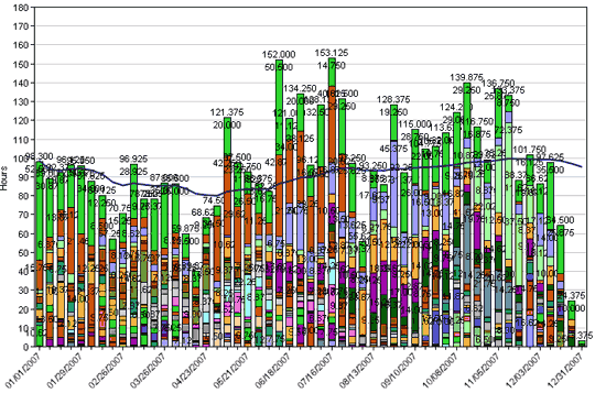
The Weekly Trends report in Intervals is crucial for identifying patterns. This report reveals the busiest seasons of the year, where your time was spent, and if you are trending upwards or downwards. Visualizing these trends aids in scheduling work, adjusting hourly rates, and calculating break-even points; all components of running a small business. In our experience, visualizing our tracked time in this way reinforces the predict-track-learn methodology.