Fuel Use Conversion Chart

John Reeve | March 2nd, 2009 | ,

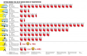
An interesting perspective on how much fuel we consume depending on our mode of transportation. Provides some good visuals on why telecommuting is a good idea, especially considering the availability of web-based applications available online today. So take a look at the chart below and ask yourself “How can I consume less fuel?”

Fuel Use Conversion Chart

Fuel Use Conversion Chart

Click on the image above to view it full size
Leave a Reply

Intervals Blog

A collection of useful tips, tales and opinions based on decades of collective experience designing and developing web sites and web-based applications.

What is Intervals?

Intervals is online time, task and project management software built by and for web designers, developers and creatives.