In this post…
“I really like the new user interface. It’s a much-welcomed update.”
—Michael
“The updates look great! Definitely a fresh look and feel.”
—Tony
“Really love the new interface!”
—Nathan
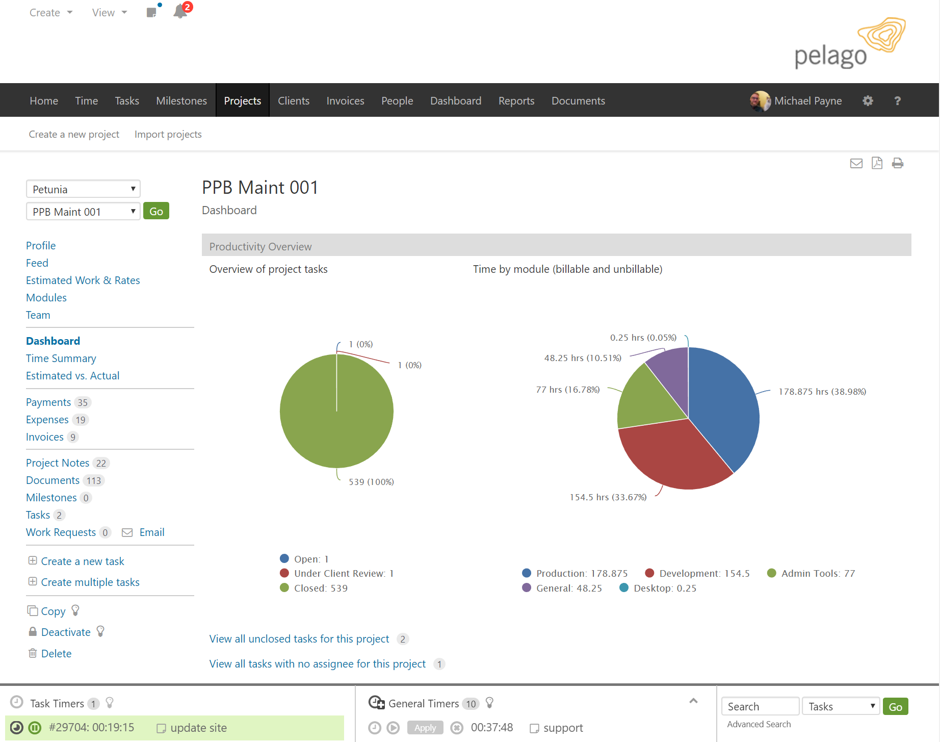
We’re excited to introduce the new “Modernistic” interface design for Intervals, our task, time, project management software. Our new look is based on several months of research and design, as well as several rounds of beta testing with existing customers (A big thank you to all those who participated in the beta).
We’ve overhauled most of the visual interface in a conscious and concerted effort to “modernize” the look. But, we’ve also refactored some of the software’s functionality to reduce clutter and make features more intuitive. Here is an overview of what’s changed…
Limited Color Palette
By first reducing the color palette to grey scale, we were able to re-introduce color intentionally and sparingly to draw the user’s attention to the most current information and relevant actions. With this new theme we’ve tried to find the right balance between grey scale and color, between letting the user rest their eyes and cuing them in to what to do next.
Flat Design
Design elements have evolved over the years as more and more businesses have adopted web-based software into their workflow. As users have become more familiar with design elements, like buttons and forms, these same elements have become less and less literal. Our new design embraces the same flat look that is becoming commonplace with most web-based software today.
New Icons
![]()
The original icons were custom designed in-house for the initial launch of Intervals over eleven years ago. They had served their purpose well, but their age was showing. We decided to let the experts handle icon design and selected FontAwesome as our font library. Adopting a professional and universal icon library arguably had the most noticeable impact on the new design.
Reduced Visual Clutter
While overhauling the look of the interface we decided to clean up a few minor features. Mainly, we’ve demoted some of the features that were used less often, and regrouped other features where it made more sense to have them visually consolidated. By reducing the visual clutter, users can focus better on higher priorities.
Getting Started
Anyone who signs up for a new Intervals trial will have the modernistic interface by default. Existing customers can load the new design by logging into your account and navigating to Options -> Settings & Defaults. Select the Modernistic option from the list of themes. More instructions are available here on our help site if needed.
If you don’t have an Intervals account, click here to create one now and try out the new look.
What’s Next?
This new look is only the beginning. Up next, we’ll be overhauling the mobile experience, adding streamlined task to do lists, adding more infrastructure, and working on a new beta mobile app. Please try it out and let us know what you think.
I really like the new interface. The “flat” design is great; my only wish would be to have a “condensed” version that allowed for more information to be displayed on smaller screens.
Thanks Dave! We are kicking around some options for smaller screens and appreciate the feedback.